Sunday, 12 April 2009
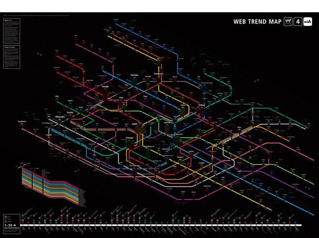
Information design is an area of design with the objective of preparing and presenting data in a model that can be deduced by a reader or viewer effectively and efficiently. The result should always be accurate, intuitive, informational and useful. Of course, since this process of presenting data involves organising, labeling and visualising information, information graphics should be neat and aesthetically pleasing. However they are certainly not meant to be looked at as works of art. Unfortunately, this is a trend I see. While I am not discrediting all those who have dabbled in this area (myself included), I worry that the intent of this field is eroding. Am I wrong in believing this?
I shall leave you to form your opinion with the following project from Information Architects. It is the fourth and latest iteration of their highly popular Web Trend Map series: Web Trend Map 4.

Tags: Graphic Design, Information Design, Posters
Posted in Uncategorized | No Comments »
Sunday, 12 April 2009
I was a mere toddler when Andy Warhol died. Growing up in a stuffy environment void of artistic expression, I did not even know of him until my late teens. Yet, as a leading figure in the pop art movement, his work was without a doubt hugely influential in my introduction to the art world. It shaped my perception of art and expression and altered profoundly the love-hate relationship I have with mass culture. If his work had such as impact on me, it must also have on others, especially ones who grew up in the height of this era.
Perhaps this is why I have always found Douglas Coupland’s work to be highly compelling. While there are parallels to their work, each is distinctively different in point of view. Says Coupland, who never knew Warhol, “He cast the largest artistic shadow of the 20th century. All 21st century artists have to constantly redefine their professional relationship with him.”

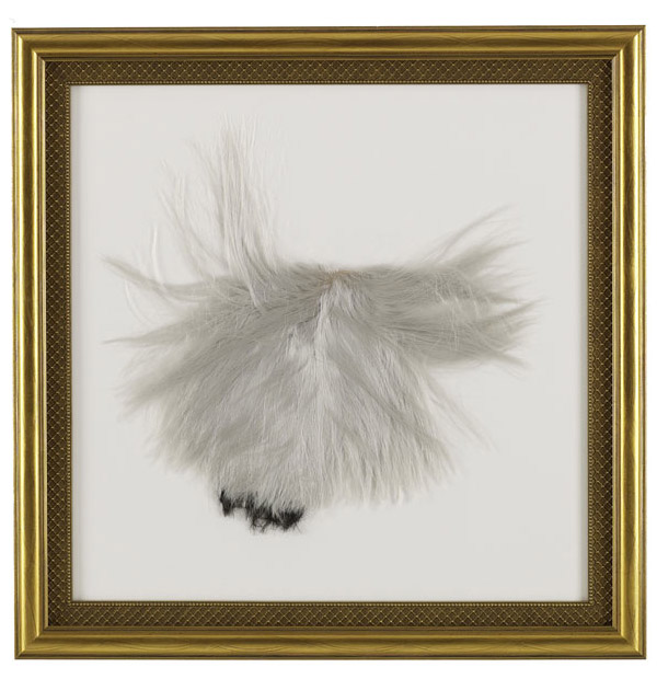
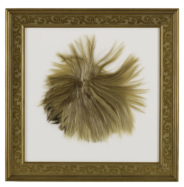
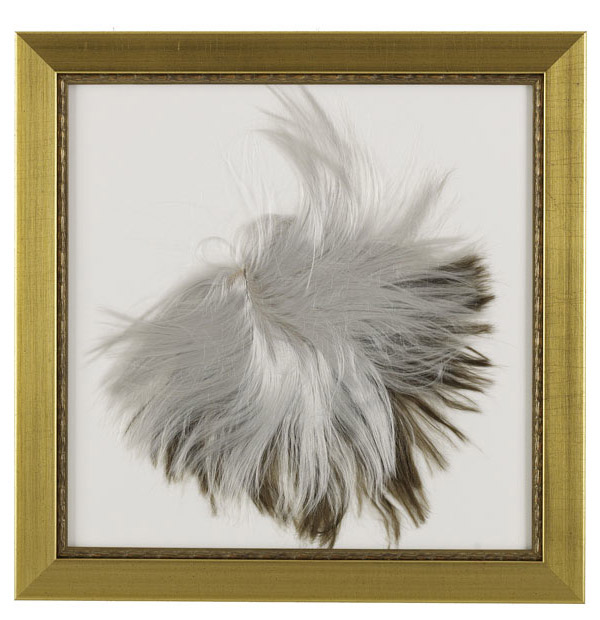
This is the position he takes on his new exhibition. In Mom & Dad, Coupland “uses personal family experience and his decades working within the pop culture arena to compile a set of works that renegotiate his ongoing relationship with Andy Warhol. The works are highly personal, based on his B.C. upbringing in a family heavy with guns and taxidermy. Using unexpected materials, Coupland finds a route to Andy Warhol that is personal, shamanic and eternal.”


This series is currently exhibited in Monte Clark Gallery in Vancouver until May 2, 2009.
Tags: Art, Vancouver
Posted in Uncategorized | No Comments »
Sunday, 12 April 2009
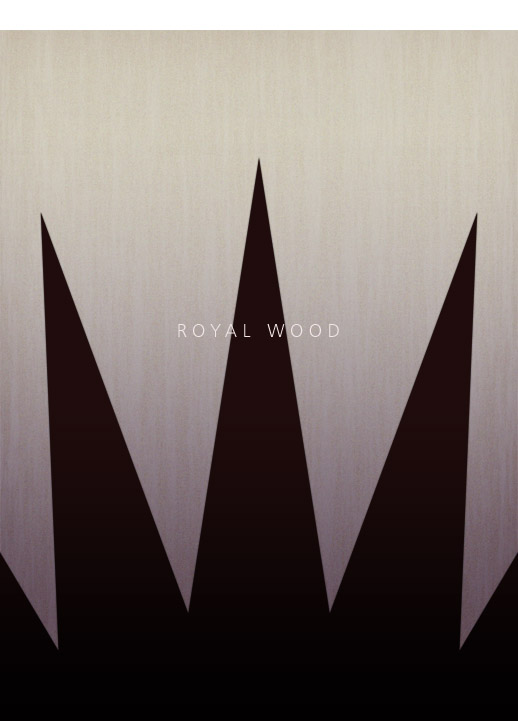
Royal Wood is a self-taught musician from Toronto. I first heard of him a few months ago on CBC. His uncanny yet compelling name piqued my curiosity. Is he a tie-dye-garbed, Mary Jane-smoking hippie armed with a banjo? Is he part of that group that mourns the death of trees? His name certainly alludes to that - quite literally in fact…
As it turns out, he is not. He writes melancholic, unabashedly nostalgic songs that explore the emotional foundation of our most cherished of relationships. While I grew to adore his work, I simply was not able to shake my curiosity. I still have yet to find out the answer.
Regardless, I started to think about names and the process of picking the one name that would eventually become your brand. A lot of thought must go into this decision, so it is only fair that I pay as much attention to the name as I do to the music. Then it dawned on me: What if I tried to visualise these names? Perhaps some iconography?
Here is the first of many potential ones I plan to attempt:

Tags: Graphic Design, Posters
Posted in Uncategorized | No Comments »
Saturday, 11 April 2009
I have always loved stamps. While I no longer collect them, they still inspire my imagination. Acting as tiny windows into our past and present, they serve up snippets of our heritage, culture, environment, aspirations and the like in the form of small pictures - informationally rich small pictures. With so many aspects of our lives to choose from as subject matter a stamp, it is hardly surprising that postal services around the world are inundated with suggestions, yet only a fraction of these suggestions are ever produced.
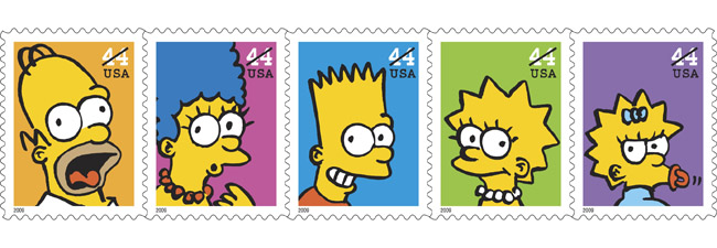
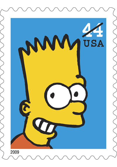
Created by Matt Groening, this satirical parody of middle-class America debuted on national television on December 17, 1989. Currently in its 20th season, it is the longest-running comedy in television history. A true cultural phenomenon, United States Postal Service has bestowed upon the much-beloved dysfunctional family the honour of being featured on postage stamps:

“We are excited to celebrate The Simpsons on postage stamps,” said U.S. Postal Service Executive Director of Stamp Services David Failor. “Eyebrow-raising to say the least, this witty, well-written pop icon continues to irreverently satire its parody of a middle-class family as it lampoons American culture.”

I will be ordering mine.
Thank you Mark Saunders and Roy Betts from USPS for providing the images.
Tags: Illustration, Stamps
Posted in Uncategorized | No Comments »
Sunday, 5 April 2009
What is the difference between ‘to design’ and ‘to style’?
I chanced upon a conversation today in which the word ‘design’ was used to refer to an end product that is high on ’style’ and low on ‘design’. This blatant misuse of the word in certain coctexts has, in my opinion, contributed to the misconception of what ‘to design’ really refers to. What do I mean?
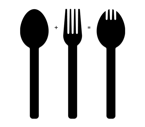
Take, for example, the fork and the spoon. Both these forms of cutlery have universal shapes aimed at fulfilling specific tasks: the fork, for spearing; the spoon, for scooping. One can certainly fashion forks and spoons that pay homage to our many -isms, but is doing so ‘to design’ or ‘to style’?
Now, take a look at the spork, also known as the foon. Just as their given names suggest, the spork is indeed a blend of the spoon and the fork. Its compact, double-duty nature is ideally suited to the needs of backpackers and fast food chains.

Needless to say, I consider the fork and spoon example I raised as a ’styling’ exercises. The functional aspects of the fork and the spoon did not change. They were simply re-imagined by means of adapting stylistic cues of years past to suit contemporary aesthetics. The process involved little innovation, if any at all.
The spork example, on the other hand, was designed to meet certain needs. It fulfilled a void in the cutlery family by leveraging the functions of both the fork and the spoon. This process involved innovation.
Is this a question of semantics? Perhaps so, but I sincerely think that a distinction needs to be made between ‘design’ and ’style’. The former seeks to meet a need through innovation while the latter merely aims to appeal to contemporary tastes by responding to trends.
Tags: Musings
Posted in Uncategorized | No Comments »
