Thursday, 11 June 2009
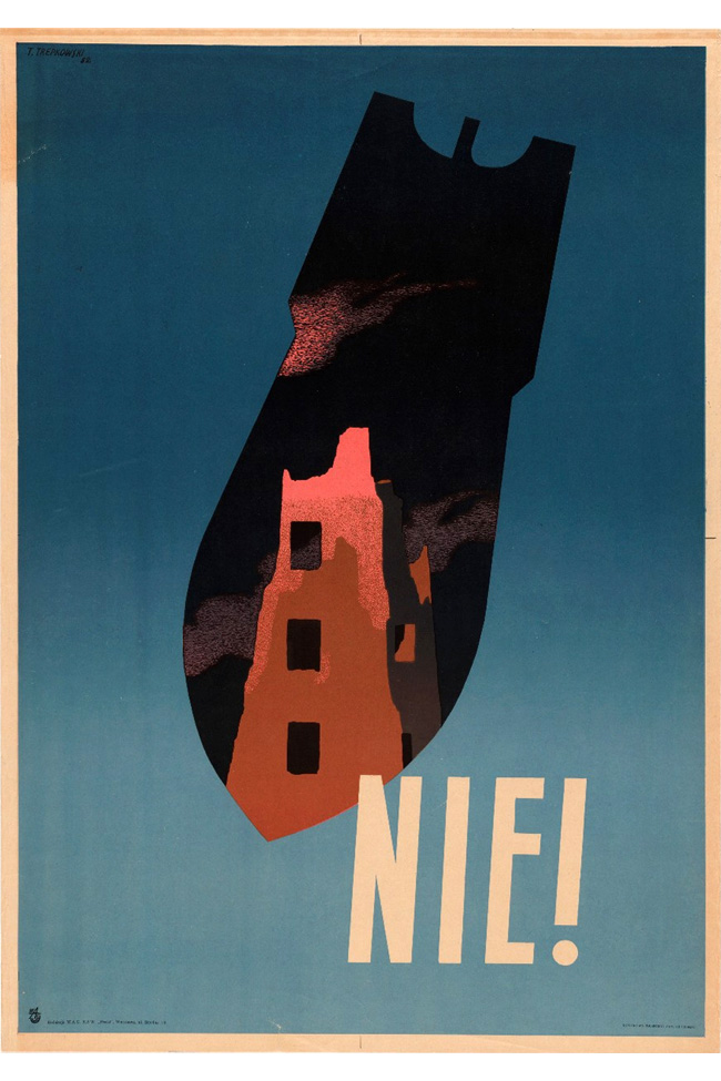
Artistic expression is almost always a reflection of the world around us. What happens to our design sensibilities and aesthetics when faced with emotional turmoil? Or the strife that we face during wartime?
I came across a poster by self-taught Polish designer Tadeuz Trepkowski depicting the anger, fear and devastation brought on by World War II. The simple (a bomb and a building) and surreal imagery is offset by dramatic use of colour, portraying - rather tellingly (’Nie!’ translates to ‘Never!’) - his feelings regarding the political instability and sense of impending doom.

Tags: Graphic Design, Posters, War
Posted in Uncategorized | No Comments »
Thursday, 11 June 2009

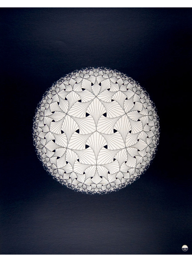
Created by Richard Carey:
“I drew this circle limit pattern on a structure of hyperbolic curves. The pattern is based on the theory of curves within a triangle and how it takes an infinite amount of straight lines to make a perfect curve or circle. This theory is mirrored in the hyperbolic repetition of this pattern getting smaller and smaller as it continues to the edge of the circle.”
Tags: Graphic Design, Posters
Posted in Uncategorized | No Comments »
Wednesday, 10 June 2009
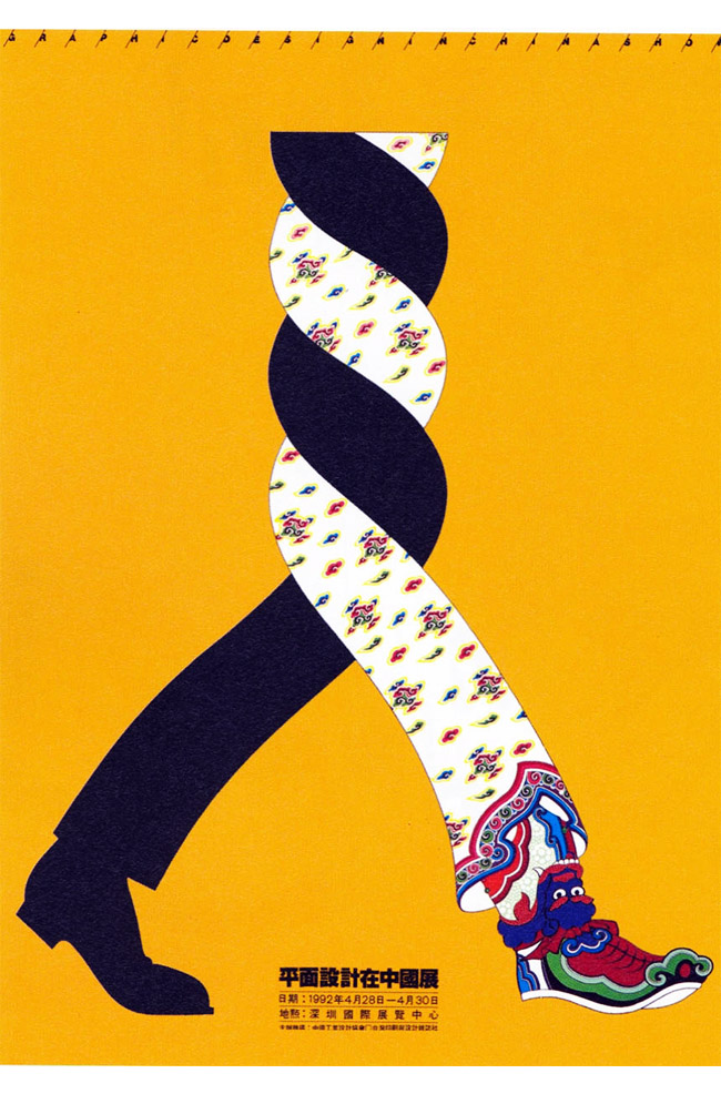
My education and upbringing were heavily steeped in tradition. I spent countless hours practicing chinese calligraphy, studied extensively classical Chinese, Malay and English, even learnt to play Guzheng along the way. So, it is hardly surprising that my design sensibilities and aesthetics are very much influenced by old world philosophies and ideas. How does meld old with the new? How does one reappropriate the old to suit the new? I am part of the modern/contemporary generation, yet I also want to exert my identity and cultural heritage into my work whenever it is appropriate. I am just still exploring the art and design world around me and finding out how to better myself, but it is a question that I am always pondering.
This is certainly not a new topic; many designers and artists - particularly the ones that are in historically rich and culturally solidified countries such as China - face the same issue. With the world also on the fast track to becoming a global village, we also face another issue - how does Eastern sensibilities fuse with Western ones?

Poster created by Chen Shaohua.
Tags: China, Graphic Design, Posters
Posted in Uncategorized | No Comments »
Wednesday, 10 June 2009
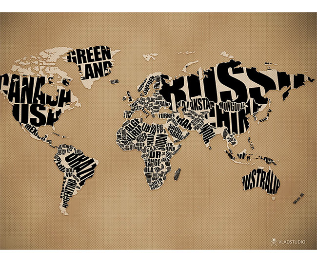
Typography + Cartography = DROOL!

Great wallpaper by Vlad Gerasimov.
Tags: Graphic Design, Typography
Posted in Uncategorized | No Comments »
Tuesday, 9 June 2009
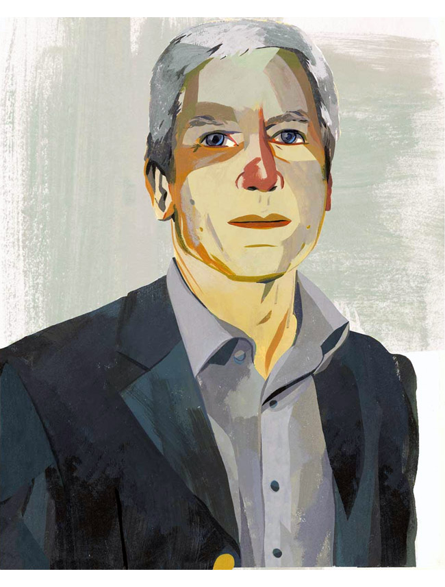
There are lots of street portraitists perched along Robson Street in Vancouver. I never really linger around to see them work, but I have always admired their ability to paint or sketch in someone’s likeness. It is definitely a talent that I lack and envy. It is even more enviable when the artist has a very strong personal style, like Justin Gabbard’s cover depicting Larry Gagosian for D2 Magazine:

Fantastic!
Tags: Illustration
Posted in Uncategorized | No Comments »
Tuesday, 9 June 2009
Over the past few days, I have been exploring with only 2 colours - black and white. I was trying to challenge myself to rid most of everything I produced of colour for one week. Initially, it was a very surreal experience - black and white can be graphic and bold, yet shades of grey can be serene and soft. It forced me to see the world in, literally, black and white. However, I also quickly became tired of the lack of colour. I don’t usually remember my dreams very much, but I suppose my inner psyche yearned for colour so much that I began dreaming in vivid colours - kaleidoscopic colours so saturated and rich that I began thinking of colour in a whole different way. It was a very interesting experience, albeit one that I would not subject myself to again in the future.
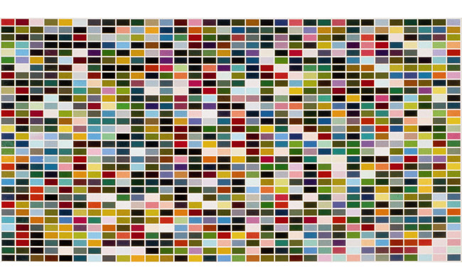
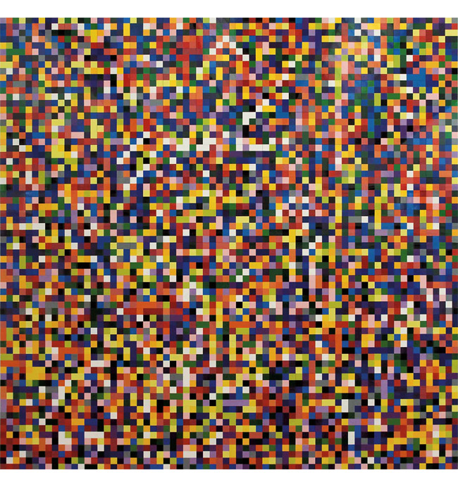
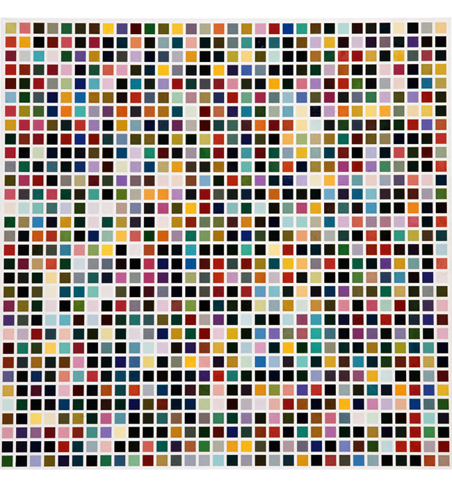
“Gerhard Richter is one of the world’s greatest living artists and perhaps its greatest living painter. Since the early 1960s, he has tirelessly explored the medium of painting… 4900 Colours is a major new work comprising bright monochrome squares randomly arranged in a grid to create a field of kaleidoscopic colour. The 196 square panels of 25 coloured squares can be reconfigured in a number of variations, from one large-scale piece to multiple, smaller paintings.”

“4900 Colours is parallel to Richter’s design for the south transept window of Cologne Cathedral, which replaced the stained glass that was destroyed in World War II. The window, unveiled in August 2007, comprises 11,500 hand-blown squares of glass in 72 colours that are derived from the palette of the original Medieval glazing. The Seemingly arbitrary distribution of colours was generated using a specially developed computer programme and this renewed interest in using chance to define composition led the artist to develop the concept for 4900 Colours.”

“Richter produced the first in his series of grid paintings in 1966 in which he replicated, in large scale, industrial colour charts produced by paint manufacturers. As with his photo-paintings, the use of found material as a source removed the subjective compositional preferences of the artist, however, the Colour Chart Paintings took this a step further, eradicating any hierarchy of subject or representational intent, and focusing on colour to create an egalitarian language of art.”

Text sourced from Art Tattler.
Tags: Art, Painting
Posted in Uncategorized | No Comments »
Sunday, 7 June 2009
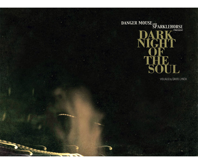
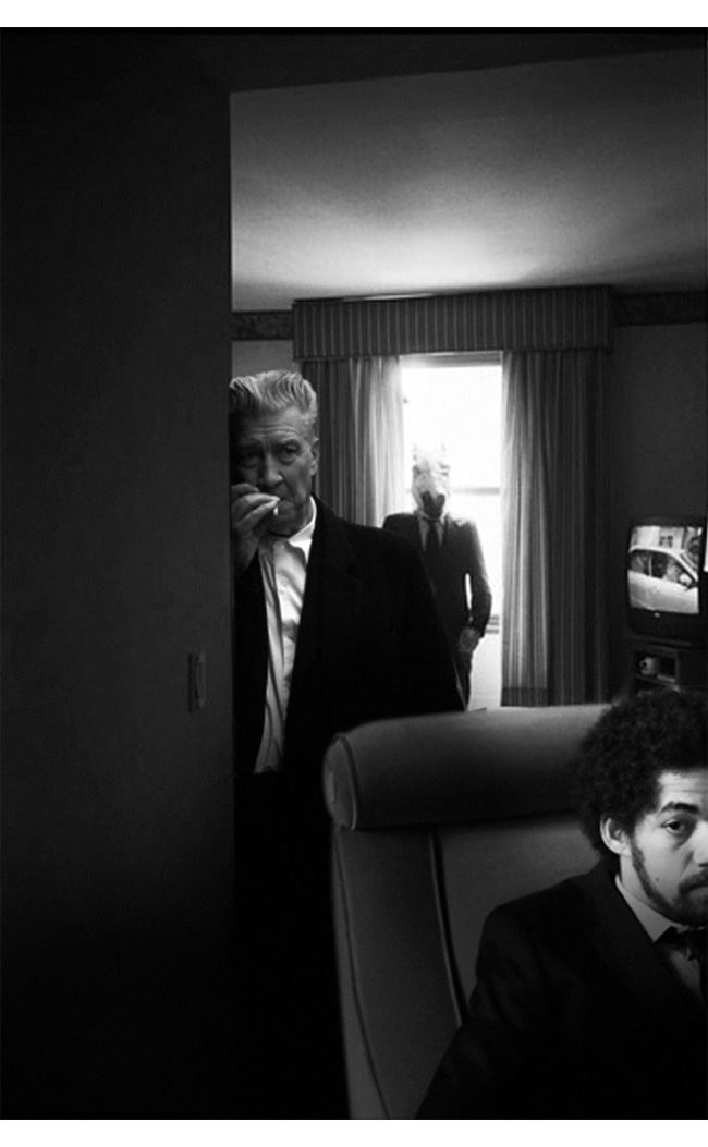
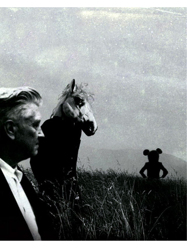
“Iconoclastic filmmaker David Lynch and music visionary Danger Mouse (aka Brian Burton - of Gnarls Barkley) are collaborating on their first ever project and installation, Dark Night of the Soul, on view at the Michael Kohn Gallery from May 30 through July 11, 2009.”

“For their premiere collaboration, David Lynch and Danger Mouse have designed a two-room installation at Michael Kohn Gallery capitalizing on the interplay between the music from Danger Mouse’s and Sparklehorse’s album Dark Night of the Soul and the artwork David Lynch created for the album, allowing the mediums of art and music to complement one another. Fifty of Lynch’s photographs are mounted on aluminum panels that seem to float on the gallery walls, reinforcing the moody rhythms of the music from Dark Night of the Soul that will play throughout the gallery.”

“Dark Night of the Soul is also the title of a full-length album and illustrated book (available here) combining the talents of Danger Mouse, David Lynch and celebrated rock recluse Sparklehorse. In addition to the 100+ page book of David Lynch’s original
photographs, the album features artists such artists as the Flaming Lips, Iggy Pop, Frank Black, James Mercer (The Shins), Julian Casablancas (The Strokes), Nina Persson (The Cardigans) and Suzanne Vega, among many others.”

The entire album is now streaming on NPR.
Posted in Uncategorized | No Comments »
Friday, 5 June 2009
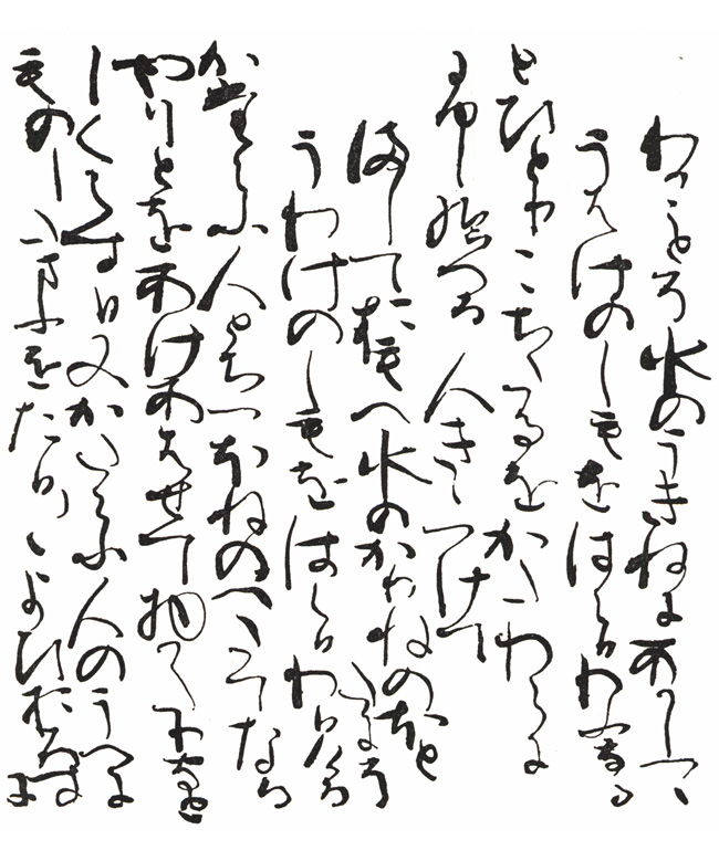
The Sarashina Diary is a memoir written by Lady Sarashina (as she is commonly known), a lady-in-waiting of Heian-period Japan. Her work stands out for its descriptions of her travels and pilgrimages and is unique in the literature of the period, as well as one of the first in the genre of travel writing.

The most authoritative copy of Sarashina Nikki is one produced by Fujiwara no Teika in the 13th century, some two hundred years after Lady Sarashina wrote the original. Teika copied Lady Sarashina’s work once (one of the pages shown above), but his first transcription was borrowed and lost; the manuscript he worked from was itself a second-generation copy of a lost transcription. To compound the problems, sometime in the 17th century Teika’s transcription was rebound, but the binder changed the order of the original in seven places, making the diary less valuable and more difficult for scholars to understand. In 1924, Nobutsuna Sasaki and Kōsuke Tamai, two classical literature scholars, examined the original Teika manuscript and finally discovered what had happened, leading to a reevaluation of Sarashina’s work. It is from this correctly re-ordered version that all modern versions are made.
Sourced from Fujiwara no Teika.
Tags: Calligraphy
Posted in Uncategorized | No Comments »
Thursday, 4 June 2009

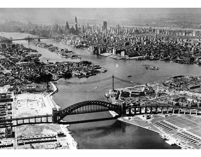
An aerial view taken on April 29, 1935, showing the Hell Gate Bridge (foreground) linking Wards Island (right) with Astoria across the East River. In the rear of the Hell Gate Bridge can be seen the cable strands for the new Triboro Bridge. Further down the East River can be seen Welfare Island and above it the Queensbourough Bridge. At the right is Manhattan Island with the New Jersey shore in the far distance.
Sourced from Art Daily.
Tags: History
Posted in Uncategorized | No Comments »
Wednesday, 3 June 2009

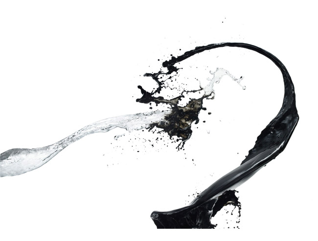
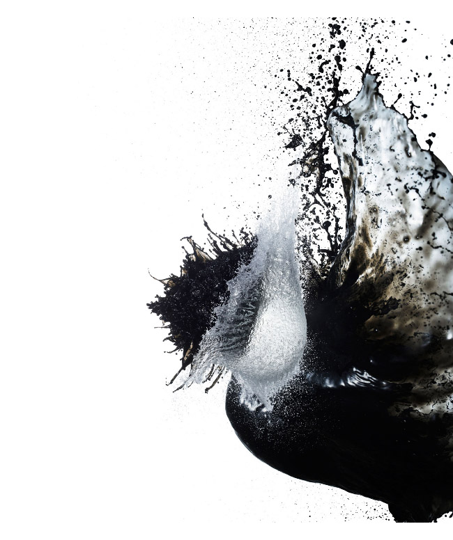
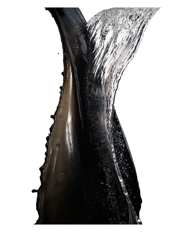
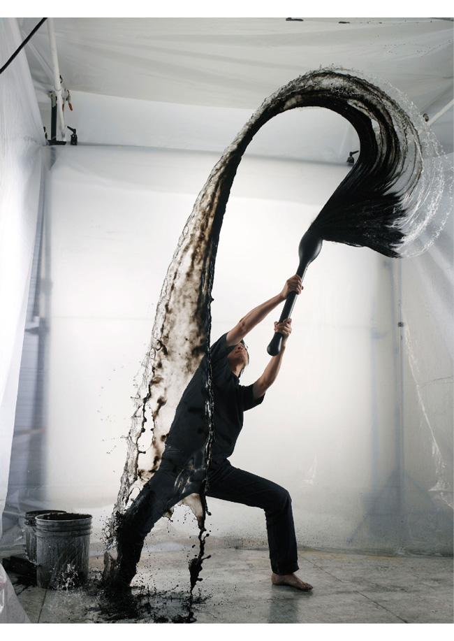
“Shinichi Maruyama’s work is subconsciously influenced by a Japanese sense of beauty. This sense of beauty can be found in the concept of “wabi-sabi,” referring to the beauty of imperfection and understated elegance. Additionally, this beauty is also expressed in “ma,” the use of negative space, found in the art of calligraphy as well as in the design a of a traditional rock garden.”

“As a young student, Maruyama often wrote Chinese characters in sumi ink. He loved the nervous, precarious feeling of sitting before an empty white page, the moment just before his brush touched the paper. He was always excited to see the unique result of each new brushing. Remembering those childhood moments, of ink, water and empty page, he fashioned a large “brush” and bucket of ink. He gets the same feeling, a precarious, nervous excitement, standing before the empty studio space. Each stroke is unique, ephemeral. He can never copy or recreate them.”


Text sourced from NY Arts Magazine.
Tags: Photography
Posted in Uncategorized | No Comments »
